
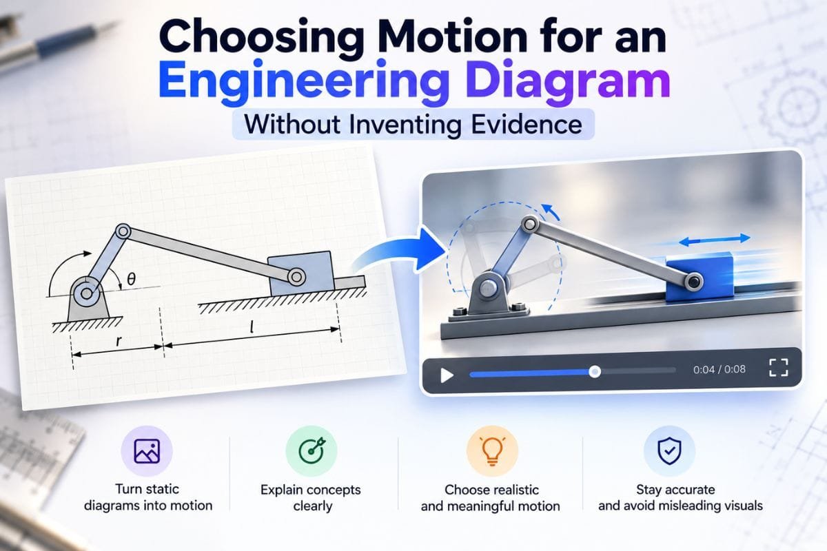
A moving diagram can make an engineering explanation easier to follow, but movement also makes an illustration look convincing. A light traveling along a line may appear to show a measured signal. A component that changes shape may seem to demonstrate a tested response. Before animating a student project, decide what the picture represents and what evidence supports it.
Consider a hypothetical classroom concept: a sensor feeds a controller, which sends a command to an indicator. The student draws three labeled blocks and arrows between them. This is an explanatory model, not a photograph of a working prototype or a record of an experiment. The task is to communicate the intended sequence without implying that the pictured system has been built, calibrated, or validated.
Table of Contents
Start with the explanation, not the animation
Write one sentence describing what the viewer should understand. For this example, it could be: “The controller receives an input, evaluates a stated condition, and sends an output command.” That sentence gives the illustration a limited job. It does not claim a particular response time, accuracy, voltage, or reliability.
Draw the source yourself, using simple shapes and your own labels. Keep arrows clearly separated from decorative lines. If the diagram omits power, feedback, error handling, or physical connections, say that it is simplified. A block diagram and a circuit schematic serve different purposes; do not present one as the other merely because both contain connected shapes.
Put important terminology in a separate caption or text panel as well as in the image. A reader should be able to understand the concept when the video is paused, the animation is unavailable, or the labels appear too small on a phone.

Route one: keep the diagram still and reveal the sequence
A static diagram or short slide sequence is often enough. Show the complete model first, then highlight the input block, controller, and output in successive frames. Leave the underlying arrows and labels unchanged. This gives the audience a sequence to follow while preserving the structure they need to inspect.
This route is useful when the main challenge is reading order. It is also straightforward to include in a report: each frame can stand on its own, and the accompanying paragraph can explain the transition. Motion is optional because the information remains in the still images.
Use ordinary language such as “conceptual input stage” or “illustrative processing step” where necessary. A highlight is an emphasis device. Unless it comes from an actual measurement, it should not be labeled as a signal trace, diagnostic result, or demonstration of electrical behavior.
Route two: author the movement on a timeline
Choose a conventional animation or video editor when the exact order matters. Keep the original blocks fixed and animate a separate highlight or annotation. A timeline lets the creator place an event deliberately, pause before the next step, and decide how long each caption remains visible.
For the hypothetical controller, the sequence might reveal an input annotation, display the condition being considered, and finally emphasize the output arrow. The creator should write that logic explicitly rather than leaving the audience to infer it from a moving dot.
This method requires more preparation than a slideshow. Separate layers help when labels must remain readable while a decorative element moves. Review the exported file as well as the editor preview: text size, cropping, and transitions may look different in the final viewing context.
Authored timing is still not experimental timing. A two-second pause chosen to help a reader does not establish the controller’s latency. If real timing matters, show the relevant measurement or simulation separately, with its units, method, assumptions, and source.
Route three: explore generated motion around the illustration
Image-to-video generation can be considered when the aim is an introductory visual or a motion concept rather than a precise technical sequence. For example, Magic Hour’s image-to-video tool accepts a starting image and an optional description of the desired movement, then produces a video that can be previewed and downloaded. That input workflow does not establish engineering correctness.
A restrained concept could request a slow camera movement around an original, nontechnical illustration of a student workspace. Keep the authoritative block diagram in a separate static panel. Generating motion directly from a dense schematic introduces unnecessary review work when its smallest details carry the explanation.
Check whether generated frames change text, join previously separate lines, add components, or alter the number of terminals. If the result changes the meaning, discard it or use a different presentation route. An attractive frame cannot compensate for an incorrect connection.
Describe an accepted clip as an AI-generated concept visualization. Do not call it prototype footage, simulation output, or an experiment. If a reader needs reproducible technical behavior, use a suitable analysis or simulation workflow and document it independently.
Review the diagram against its evidence
Compare the finished presentation with the original explanation sentence. Can a viewer identify each block? Do the arrows mean information flow, a physical connection, or simply reading order? Are those meanings consistent in the image, captions, and narration?
Provide a way to pause or replay the sequence and retain the static alternative. Avoid rapid flashing and unnecessary continuous movement. Let readers inspect the complete diagram before asking them to follow a transition. Captions should communicate the essential sequence even without sound.
Finally, separate what is proposed from what is observed. A planned controller architecture, an authored teaching animation, and a measured prototype response can all belong in one project, but each needs its own label. The strongest visualization helps the reader understand those boundaries instead of making the project appear more complete than the evidence shows.
About the contributor: Magic Hour provides AI tools for creating images and videos. This educational article was prepared with AI assistance for Engineer’s Planet and submitted for editorial review. It describes a hypothetical workflow and reports no firsthand experiment or product comparison.
Have any thoughts?
Share your reaction or leave a quick response — we’d love to hear what you think!
-
 0
0 - 0
- 0



